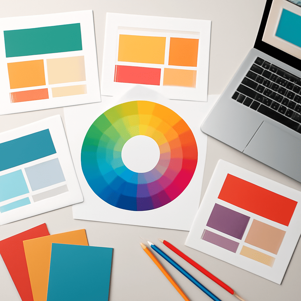
Color theory is an essential aspect of design, playing a pivotal role in creating visually engaging online spaces. By understanding and applying its principles, you can significantly enhance the user's experience, making your site not only more attractive but also more effective in communicating its message.
The Basics of Color Theory
At its core, color theory is a practical combination of art and science used to determine what colors look good together. The color wheel, developed by Sir Isaac Newton in 1666, serves as the foundation of this theory. It includes primary colors (red, blue, yellow), secondary colors (green, orange, purple), and tertiary colors, which are crafted by mixing primary and secondary colors.
Color Harmony
Color harmony refers to the aesthetically pleasing arrangement of colors. Using complementary colors, which are opposite each other on the color wheel, can create a high contrast, vibrant look. Analogous colors, which are next to each other on the wheel, offer a more relaxed and serene feel. Triadic color schemes, involving three colors evenly spaced around the wheel, create a balanced yet dynamic look.
Psychological Impact of Colors
Colors evoke emotions and feelings, having a profound impact on perception. For instance, blue often conveys professionalism and trust, making it a popular choice for corporate settings. On the other hand, red can evoke passion and urgency, useful for drawing attention or encouraging action. Understanding the psychological effects of different hues helps in selecting the right palette to convey the desired message or atmosphere.
Using Color to Guide Users
Effective use of color can guide users’ attention to key elements. Highlighting buttons or calls-to-action in bold, contrasting colors makes them more noticeable. Similarly, using a consistent color for headings and subheadings helps in organizing information, making it easier for users to navigate the site.
Accessibility Considerations
While aesthetics are important, ensuring accessibility is crucial. This means selecting color combinations that are easily distinguishable by everyone, including individuals with color vision deficiencies. Tools are available online to check color contrast and ensure content is legible to all users.
Conclusion
Mastering color theory allows you to create more engaging and effective designs. By thoughtfully selecting a color palette, keeping in mind harmony, psychology, guidance, and accessibility, you can create a visually compelling experience that not only attracts visitors but also communicates your message clearly and effectively.