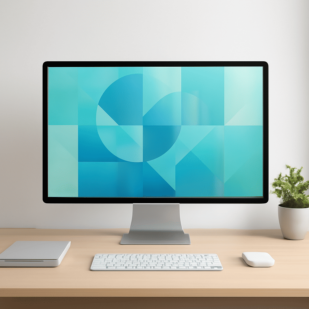
In the digital landscape, visual appeal plays a crucial role in capturing the attention and interest of users. Aesthetic design is not just about making things look good; it's about creating an interface that resonates with users and enhances their experience. Here, we delve into the core principles that contribute to visually stunning digital presences, emphasizing balance and harmony.
Balance: The Foundation of Visual Appeal
Balance in design refers to the distribution of visual elements across a page to create a sense of equilibrium. This can be achieved through symmetry or asymmetry.
-
Symmetrical Balance: This classical approach involves mirroring elements on either side of a central axis. It's often used to convey a sense of formality and order. For instance, a grid layout that divides content into equal parts can give an impression of stability and clarity.
-
Asymmetrical Balance: In contrast, asymmetrical balance involves varying visual weights on either side of the page. This can create a more dynamic and interesting composition, although achieving harmony can be more challenging. This style allows for more creativity and can convey a sense of movement or action, drawing the viewer’s eye across the page naturally.
Harmony: Creating a Cohesive Experience
Harmony in aesthetic design refers to the adoption of a consistent theme throughout the interface. It's about ensuring all elements work together to create a unified look and feel.
-
Color Scheme: A harmonious color palette unifies an interface, making sure that text, backgrounds, and interactive elements work together without clashing. Colors should complement each other and align with the brand’s personality or message.
-
Typography: Choosing typefaces that complement each other is key to maintaining harmony. Fonts should be legible and expressive, enhancing the overall tone of the design. Heading fonts can be bold and eye-catching, while body fonts are typically straightforward for reading.
-
Imagery and Icons: Use images and icons that are stylistically consistent. They should match the tone and theme of the overall design. Whether it's minimalistic line icons or detailed illustrations, consistency is key to maintaining a cohesive visual narrative.
Fostering an Intuitive User Flow
Apart from visual aspects, the functional side of aesthetics involves creating pathways that lead users naturally through the site.
-
Navigation: Clean, simple navigation is crucial. Users should be able to find what they're looking for with ease, without unnecessary complications. Clear labels, well-structured menus, and intuitive hierarchies facilitate a seamless experience.
-
Whitespace: Often overlooked, whitespace helps to prevent clutter, allowing elements to breathe and stand out. It enhances readability and focuses user attention on what's important.
-
Responsive Design: Ensuring the interface looks great on devices of all sizes is essential. A design that adapts to different screens enhances usability and engagement, providing a uniform experience across platforms.
In conclusion, integrating balance and harmony in digital aesthetics requires careful consideration of various elements that collectively create an engaging interface. By focusing on these principles, designers can craft visually appealing and user-friendly environments that not only attract but also retain the interest of their audience.