In today's digital landscape, creating an engaging online presence is more important than ever. An integral part of crafting this presence is mastering the art of balancing color, an essential component that influences a user's journey and the emotional undertones of a website.
Understanding Color Theory
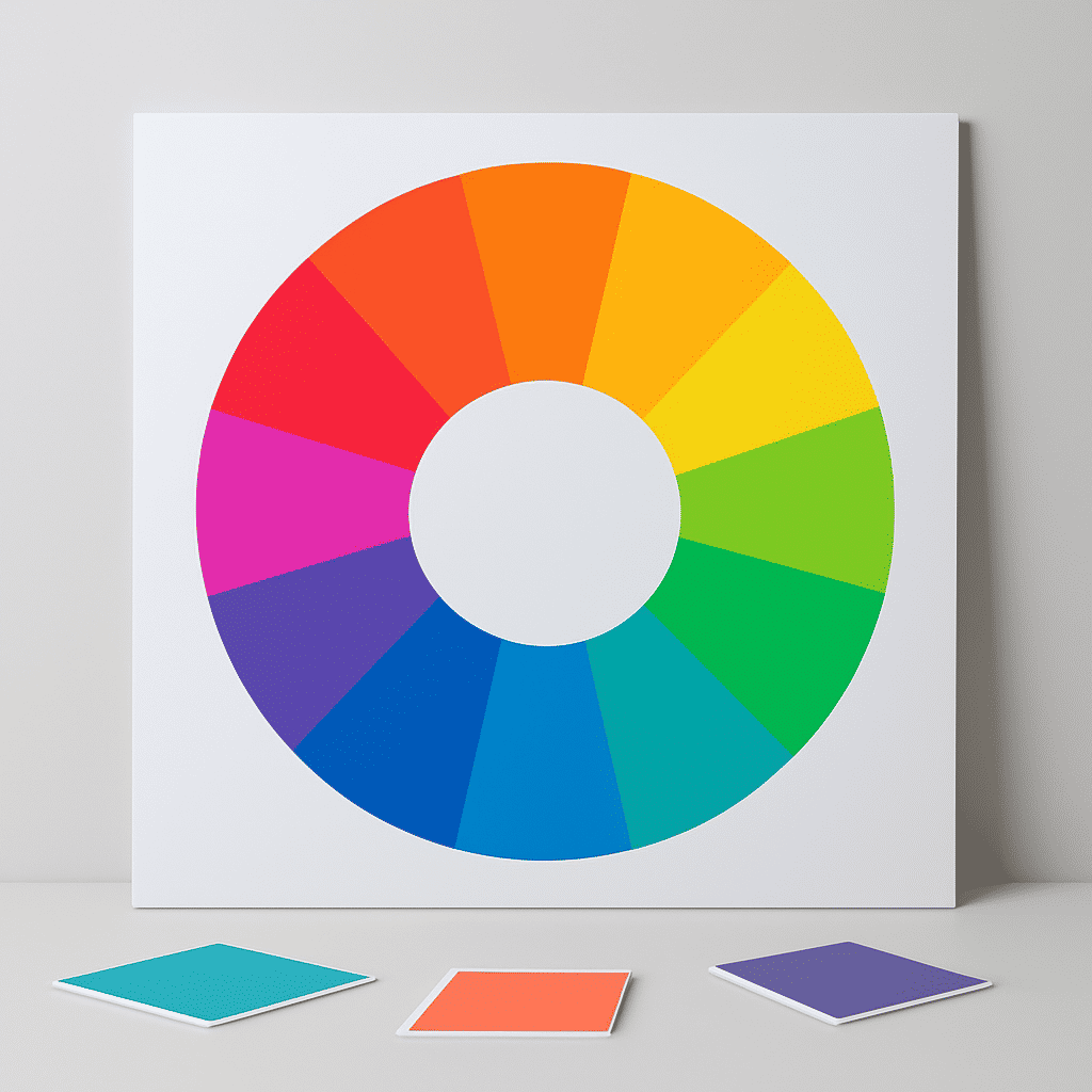
Color theory is the study of how colors interact and the effect they have on perception. It involves understanding the color wheel, color harmony, and the psychological effects of color.
Primary, Secondary, and Tertiary Colors
- Primary Colors: Red, blue, and yellow. These colors are the foundation of the color wheel and cannot be created by mixing other colors.
- Secondary Colors: Formed by mixing two primary colors. Examples include green, orange, and purple.
- Tertiary Colors: Created by combining a primary color with a secondary color.
Significance of Colors in User Experience
Colors play a pivotal role in determining how users perceive and interact with a website. Different hues can evoke specific emotions, convey messages, and even persuade users towards a particular action.
-
Warm Colors: Red, orange, and yellow are considered warm colors. They often exude warmth and can evoke feelings of excitement and energy. Different shades and tints can alter these perceptions; for instance, a deep red might suggest passion, while a lighter shade could imply a more playful energy.
-
Cool Colors: Blue, green, and purple fall into this category. Generally, these colors are calming and can evoke tranquility and professionalism. Blue is frequently associated with trust and dependability, making it a popular choice in designs aiming for reliability.
Cultural Considerations
Colors can carry different meanings across cultures. While white may symbolize purity in some Western countries, it is associated with mourning in several Eastern cultures. It’s crucial to consider these cultural nuances, especially for global audiences, to ensure the intended message is effectively communicated.
Balancing Colors
Achieving a balanced color scheme involves selecting a palette that enhances usability and supports the site’s objectives.
-
Complementary Schemes: These use colors opposite each other on the color wheel, creating high contrast and vibrant look which is great for catchiness.
-
Analogous Schemes: Utilize colors next to each other, offering a serene and cohesive look suitable for harmonious themes.
-
Triadic Schemes: Involve three evenly spaced colors on the wheel, offering balance and richness.
Tools for Implementation
Several tools can assist in selecting and experimenting with colors. Tools like Adobe Color and Coolors allow users to explore different combinations and gradients, ensuring that the chosen palette aligns with the website's identity.
Applying Color for a Better User Experience
Visual hierarchies can be enhanced using different colors for different types of content to guide the viewer’s attention. For instance, using a contrasting color for call-to-action buttons can increase conversion rates.
Moreover, accessibility is a vital consideration. Ensuring sufficient contrast between background and text colors is essential for readability, especially for those with visual impairments.
Conclusion
The interplay of colors is a powerful tool in shaping user experiences, impacting mood, perception, and ultimately, the engagement levels of visitors. Thoughtful application of color theory can make a significant difference in how a website is perceived, ensuring that it not only captures attention but also communicates the intended message effectively. As the digital landscape continues to evolve, a strong grasp of color balance remains fundamental in crafting impactful and memorable online experiences.